Big Picture Brand Guidelines
An agency that builds brand systems for everyone else did not have a written one of its own. Twenty-seven pages, built so the next person does not have to ask.
01
The brief
The cobbler’s children
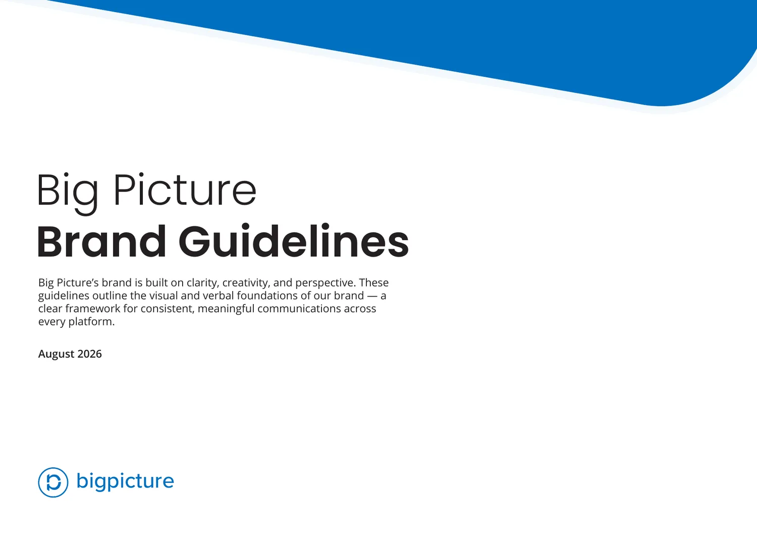
Everything existed somewhere. A logo, a blue, a typeface pairing, a habit of how decks got built. None of it was written down, so every new starter rebuilt it from whatever file they happened to open first.
So the document had to do two jobs at once: record what was already true, and decide the parts nobody had settled.
02
The mark
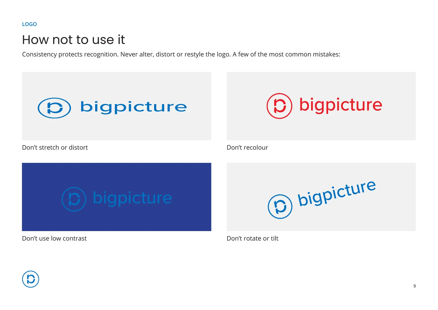
Three lockups, and the rules that keep them honest
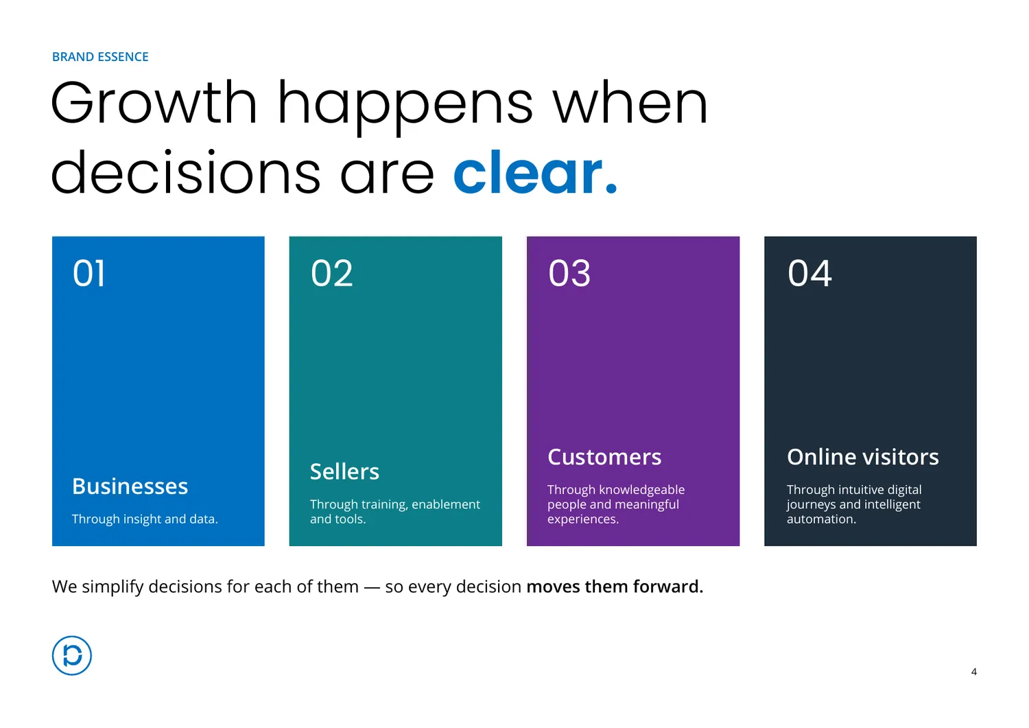
Inline, stacked and icon-only, plus the colourways for when the blue will not work. The clear space is set as the height of the lowercase e in the wordmark, which means the rule scales with the logo instead of being a number somebody has to remember.
-
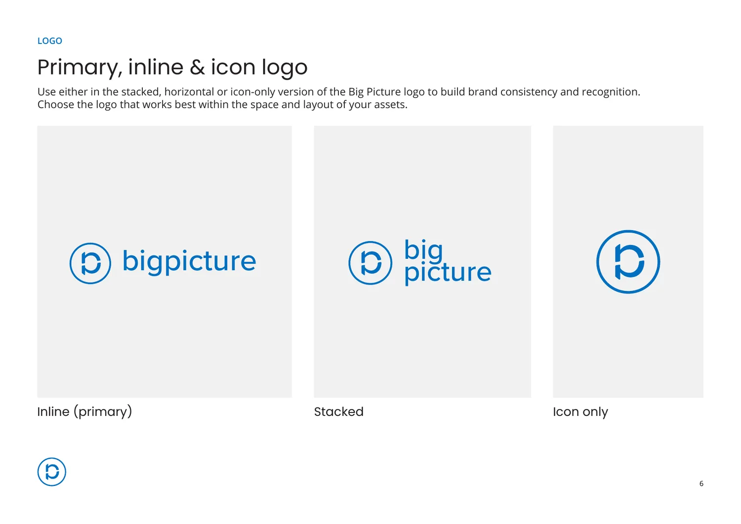
Primary, inline and icon -
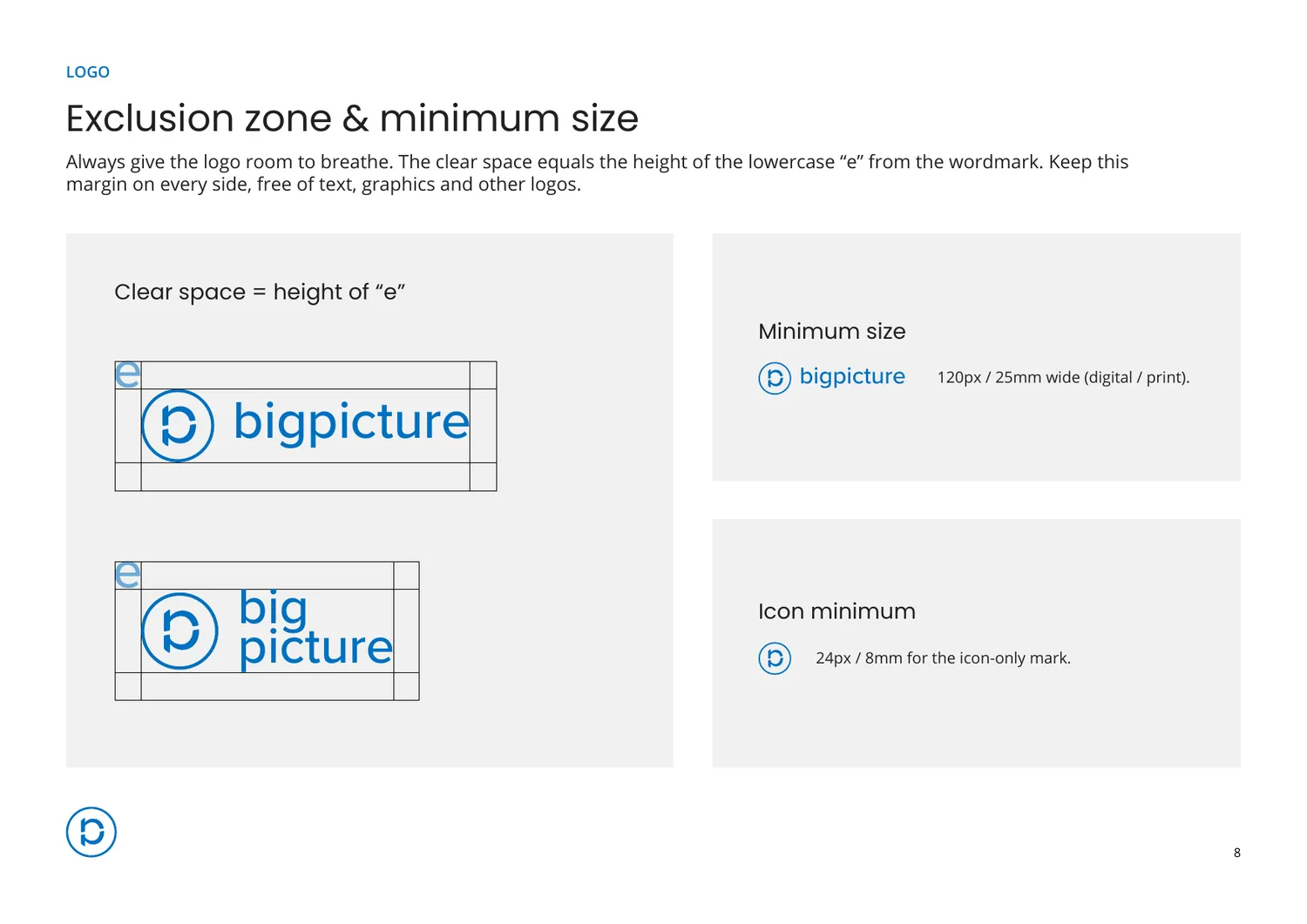
Clear space · measured in its own letterform
03
Colour and type
A palette with instructions, not just swatches
Most palettes are a row of chips and a set of hex values. The useful half is the grouping page: which combinations are sanctioned, in what proportion, and against which ground. Poppins carries headlines, Open Sans carries everything else.
-
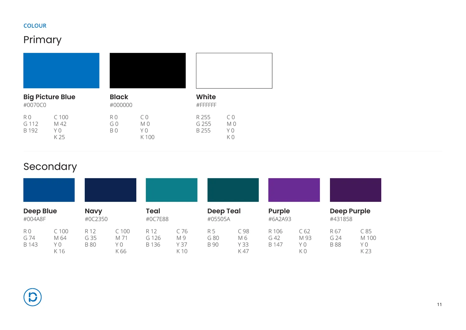
Primary and secondary -
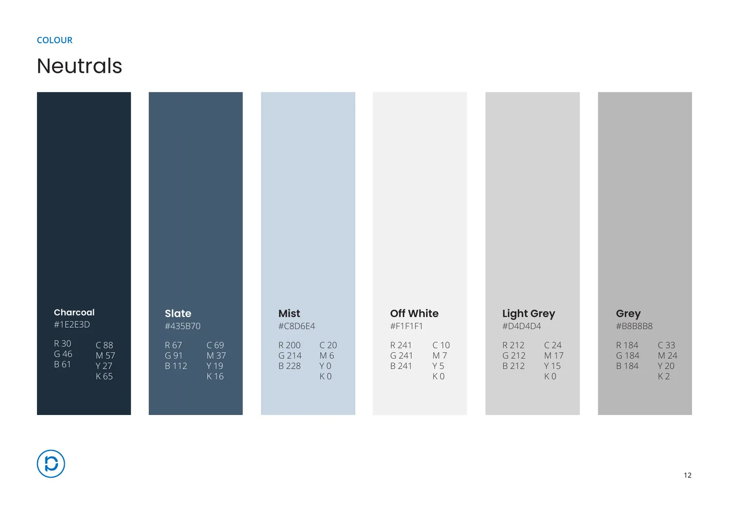
Neutrals -
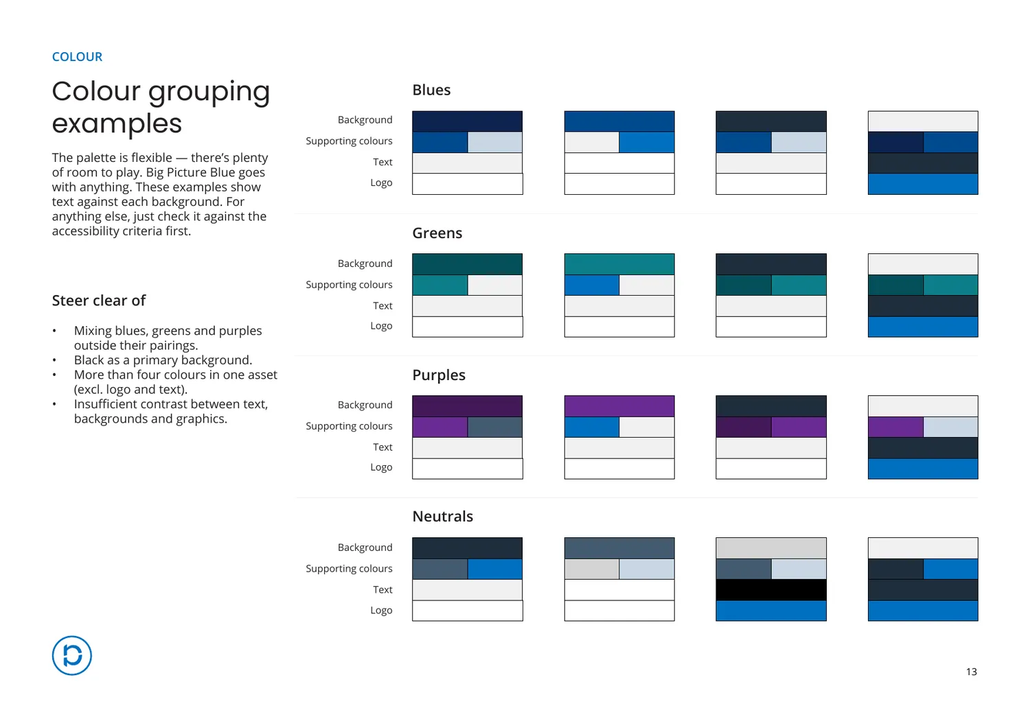
Grouping · the half that gets used
-
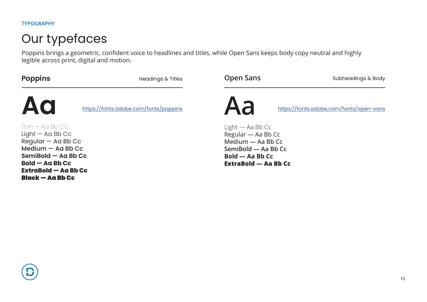
Poppins and Open Sans, with every weight -
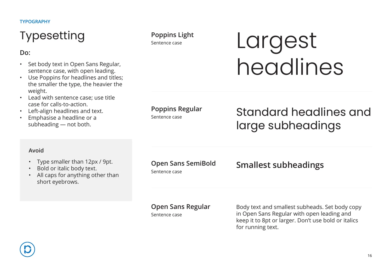
Typesetting · do and avoid, side by side
04
Accessibility
The section most guidelines leave out
Every brand colour is given its measured contrast ratio against white, with its WCAG grade next to it. 4.5:1 for body text, 3:1 for large headlines, and never colour alone to carry meaning.
Putting the numbers in the document rather than in someone’s head is what makes it enforceable. A designer can check a combination without asking, and a client can check it without us.
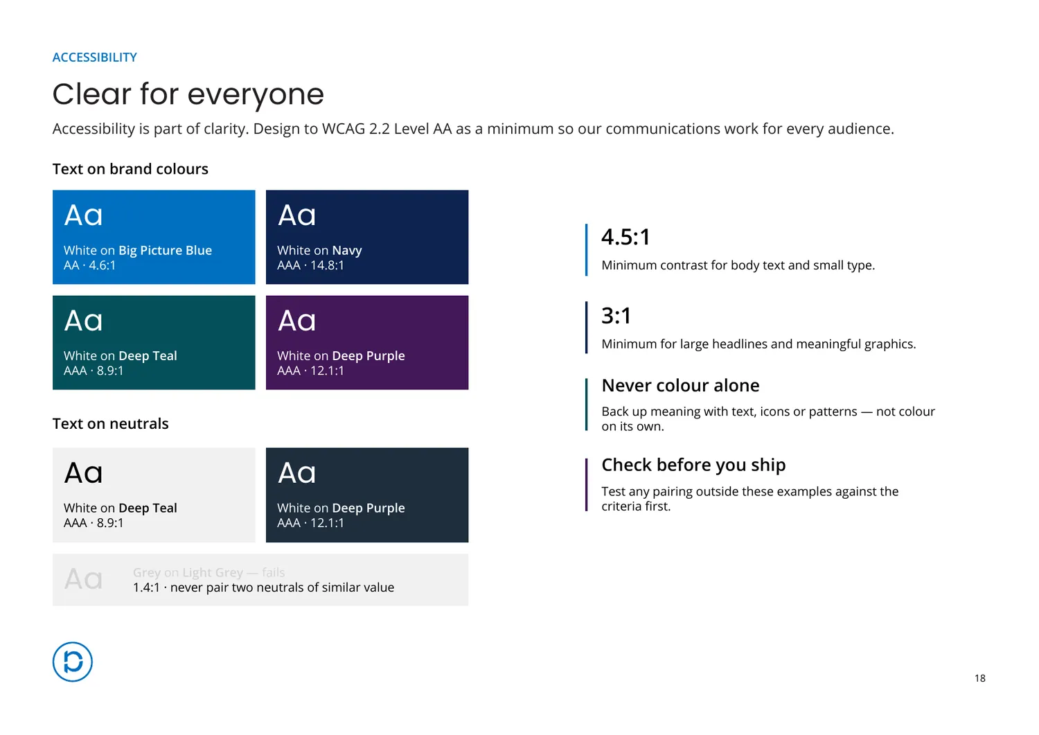
Why it earned its own section: accessibility is usually a line in a footer that nobody can act on. Written as measured pairs it becomes a production rule, which is the only form anyone actually follows.
05
Voice and imagery
Clear, confident, human
Three voice principles, each with a before and after rather than an adjective. The photography and motion sections do the same thing: real examples, and a do and don’t beneath each.
-
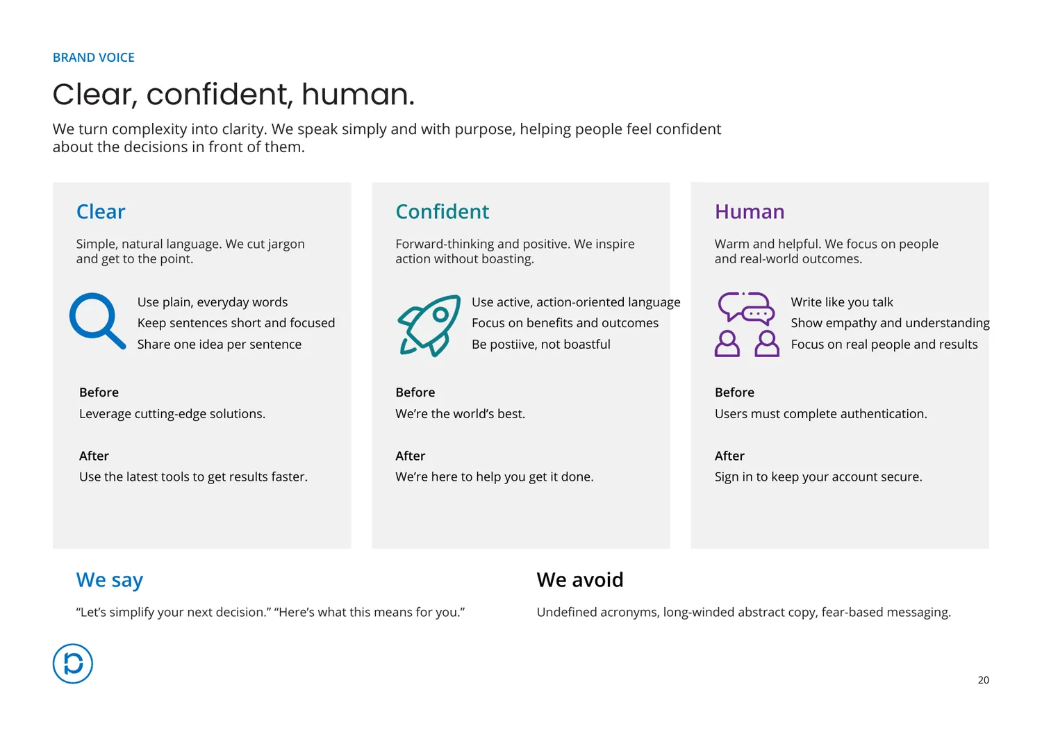
Voice · what we say, what we avoid -
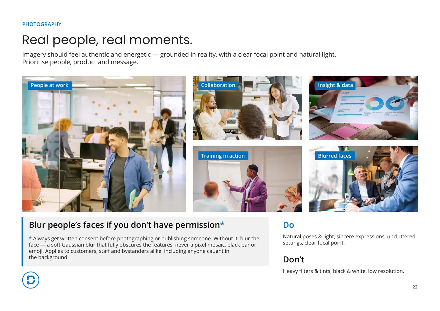
Photography · including the permission rule -
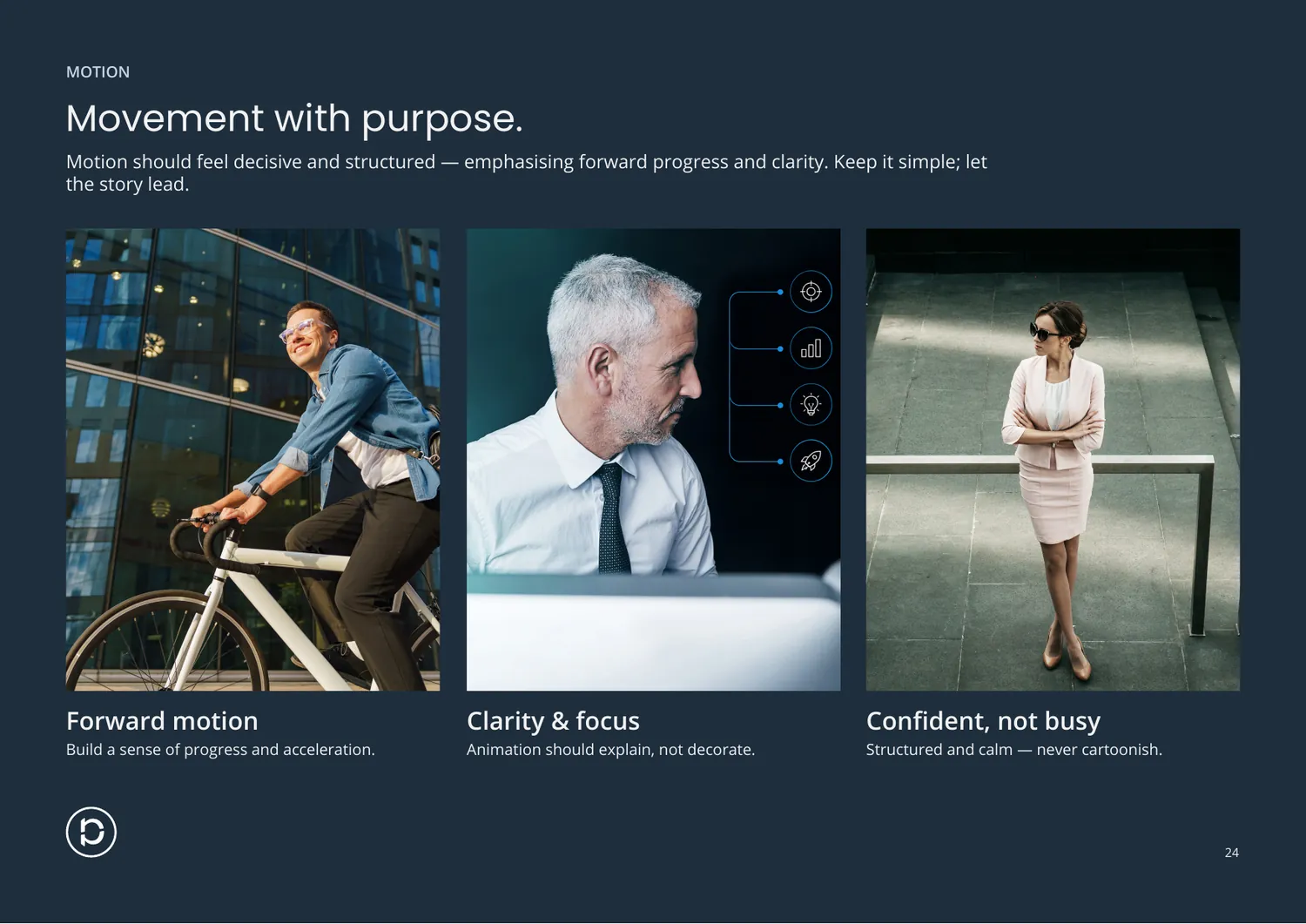
Motion · forward, clear, unhurried
06
Platforms
One family, three jobs
Nova, Epic and Orbit are three separate products doing unrelated work. Rather than three identities, they share the parent name, the type pairing, a dark ground and one component kit. Only the product icon and the name change.
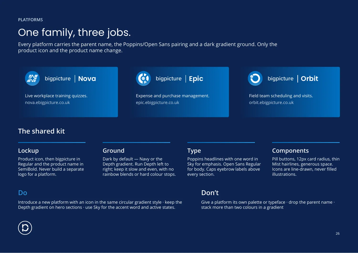
The decision underneath it: a sub-brand system is cheaper to run than three brands and easier to extend than one. A fourth product can launch without a design project attached to it.
07
Outcome
What I would point at
The accessibility and platform sections, because they are the two that change what someone does tomorrow. The rest records decisions. Those two make new ones.
It is also the only project here where I was the client. Writing the words and setting them is the same job I do on launch work, with nobody to hand the copy to.
What I would do differently: ship it as a web page alongside the PDF. A document gets downloaded once and goes stale on a desktop; a URL can be corrected the day a colour changes.